Saturday 18 October 2014

Gaze and the Media

"According to usage and conventions, which are at last being questioned but have by no means been overcome - men act and women appear. Men look at women. Women watch themselves being looked at" (Berger 1972)
image
(1)
image
(2)
image
(3)
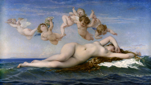
The “gaze” is a theory that describes how genders are stereotypically depicted by all forms of media. Women have been depicted as images to gaze at for centuries, and early works such as The Birth of Venus (1) are examples of this, because the central focus of the image is Venus, shown in a pose that gives the viewer permission to look at her body, and she is depicted resting and looking away from the audience.
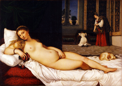
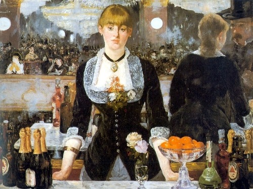
Venus of Urbino (2) depicts a woman resting in her personal environment and watches the viewer provocatively, meaning she knows the audience is watching her but lets them do so. The overall depiction of women in art are shown as nude grown up wealthy/holy women. Bar at the Folies Bergeres (3) explores the viewpoints of art, by placing a woman at a bar simply standing there waiting to take an order, with a mirror behind her showing her backside and a supposed image of the viewer watching her. The setting of the image is realistic but it destroys the concept of perspective by using the mirror behind the woman to show her at a different angle, which would otherwise not be there. It almost seems like the art is conspiring with the viewer to let us look at this regular woman from different angles.
image
(4)
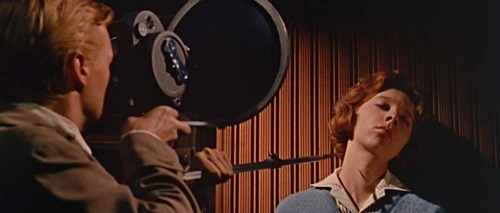
Contemporary media today takes advantage of the male gaze for advertising, using primarily nude models for billboards, magazine ads, etc. The film Peeping Tom (4) depicts objectification in a more sinister manner. It shows how objectification of female bodies affects real life female bodies, and shows the consequences of how that’s exploited in media.
image
(5)
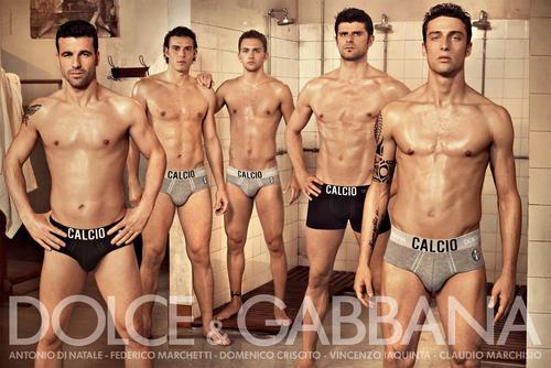
The gaze does not just refer to women, though. There are plenty of images in which men are objectified by media. Dolce & Gabbana (5) have made ad campaigns for underwear. It’s just not as heavy an issue, so to speak, for males. Audiences mainly identify with women as sexual objects, as opposed to men. There are obviously times where that’s not the case but in no way does that actually change anything.
Women are historically marginalised in art history by men, and this has led to women to typically be marginalised today.
image
(6)
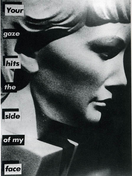
Barbara Kruger’s Your Gaze Hits the Side of my Face (6) is an image of a statue of a woman’s face with the quote, used for the title, in a similar manner to Peeping Tom, by conveying it in a violent manner, and showing that there are real-life consequences to it.
Reality television is an example of the gaze, by giving the audience permission to watch people just talking to each other in their private space and judging their actions. It’s basically giving people this power of voyeurism in a way. 
There have been plenty of campaigns speaking against objectification towards women in media, like the recent “Shut Down Page 3” campaign. Just like any other feminist campaign it ended up causing tonnes of abuse towards the campaign holders through social media.
Another common example of the gaze is the recent nude celebrity photo leaks of 2014, wherein many female celebrities (and like one dude) had nude photos leaked on the internet by people hacking cloud-based data storage.
The gaze affects male and female teenagers mainly, actually, solely due to online posts that supposedly want to relate to people insecure about their bodies, but only encourage the idea that you should worry about how you look and that objectification is something you should conform to.
image
(7)
image
(8)
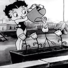
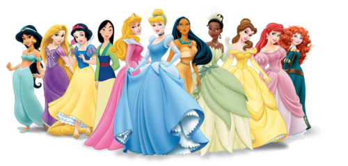
The gaze, overall, affects all forms of media today, movies, television, video games, magazines, art, etc. In terms of animation, it’s not really any different.Betty Boop (7) is a famous example, dating back to the 1920s. While the shorts she starred in were surreal and humourous by nature, there are still several times throughout her shorts (films, I mean, films) where the audience is given power to gaze at her. She was a memorable character that essentially set a standard for the female role in animation. Disney princesses (8), while not exactly conforming to male gaze, were designed in a manner that would make them pretty looking for audiences, even if that meant completely changing the character’s age, race, and personality from the film’s source material. Again, it’s not gaze material, but it does conform to trope of making female characters pretty so that they appeal to people more.
So the gaze has affected the media for centuries now and it has basically gotten to the point where it’s a social standard to objectify and overall give characters and people the model look to gaze at. I personally believe that there’s no changing that because humans as a species feel that empowered when given the opportunity to gaze, and that’s why it’s still happening.
image
(9)
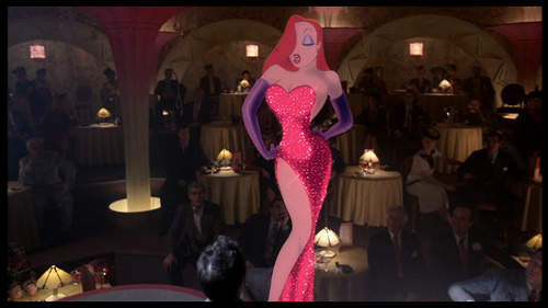
That’s also why it’s good for designers and writers to compromise creatively when characters are designed to be sexy. Jessica Rabbit (9) is another famous animated example. It’s pretty much deliberately over-the-top how sexualised she is, and I say that because while she is of course a sexy character, her design is also extremely disproportionate, with so much emphasis on her legs and bust that her waist is tiny and her legs are freaking tall. It’s seemingly a parody of the typical look given to female characters. Jessica Rabbit is also a pretty strong character, using her sexuality as a weapon most of the time. There’s also the fact the characters that harass her are all punished for it, while Roger Rabbit, the one who’s the most respectful towards her, is actually the one she loves, which I interpret as a moral to respect women, or anyone really, as humans and not just objects.
So I’m personally not against the gaze, I feel like that’s just a word that combines sexualisation and objectification, which I feel are two entirely different things. Sexualisation is acknowledging someone as sexy whilst still treating them as people, whereas objectification is simply treating a person as something to look at and use (like an object). A well-rounded character with sexual traits is far more appealing and respectful than a bland character with a nice body.

Tuesday 25 March 2014

Animation Development Work

My practical work will be based on the lecture about Visual Literacy. The reason for this is that during the lecture, a particular slide that confused most of the people there. The slide showed a picture of the symbol of Mars and Venus, which are also used to symbolise male and female. The male symbol was pink and the girl symbol was blue, which caused a lot of the people to mistake the two. This raised an interesting thought about why the majority quickly thought the colours meant the gender and not the shapes of the symbols. The whole situation felt like a visual representation on the way society views gender, not as the genuine thing but rather how they act, because association with colours something society thought of, but symbols should be the logical aspect to point to. This is further emphasised by the fact that in the 1920s, pink was considered a more masculine colour, and it seems like it's too quick a time for people to now being sub-concsiously drawn to the idea that pink is for females.


I thought about how could further antagonise this crowd by making this in such a manner that would really get them lost. They looked at the original slide for at least thirty or more seconds, so I thought my version would be a series of images that may or may not be coloured the way they would imagine, and they'd have less than a second per image to get them right.


I figured I would go for a simple look, to show the juxtaposition of their confusion whilst watching it.
This pacing felt right so I developed this into a first draft:


I showed this to people to see if they could follow it. They said they could but whether their mind really played tricks on them or they could just follow it okay, I felt like I had to make it more complicated. SO here's the final version:


As you can see, it has a faster pace, as well as some parodic music to. This one did a better job.

Auteurship and the Avant-Garde

Auteur theory is based on the idea that great filmmakers are considered artists in their own right. It was an idea thought of in the 1950s by Andre Bazin and the writers for Cahiers du Cinema, to show spectators at the time that films are not just products created by studios for profit, but works of art that rivals that of any novelist. Auteurship (which is the French word for 'authorship') is not commonly associated with animated films, due to the medium generally being looked at by critics as a children's medium, as well as associating animation with Disney, which a lot of people admire as the greatest animation studio, and this turned the animation industry into a corporate tool. There were still many great animation auteurs to come, such as Hayao Miyazaki, Ray Harryhausen, and Chuck Jones; however the medium is usually debunked by critics everywhere.

Avant-garde is a term derived from war terminology, that basically means to charge into battle ahead of the main troops, and what the term means in film context is to be more innovative with the narrative, trying different and unconventional approaches. In a sense, Jan Svankmajer manages this perfectly, merging stop-motion claymation with pixillation in his films. He can technically be seen as an auteur filmmaker in this sense, developing his own style of filmmaking and managing to avant-garde in the process.

Genre

Genre is an important aspect to consider when writing a story. It is how we differentiate one film to another, using a set of codes and conventions that signify what type of film it is. These signifiers can vary depending on how they are accomplished, for example, setting and location is considered when establishing genre; is the film based in a suburban area in a modern-day setting or a dimly lit graveyard in a 17th century setting? Is it set in a high school? Is the high school dark and abandoned or is it a regular day in the school? These are all aspects that are important. Animation is technically a sub-genre because it created using a technique completely different to live-action, but the signifiers still work in the same way.

"a family picture!"

Adventure Time, for instance, has multiple signifiers that point to different genres. The major signifiers, writing, primarily bright and colourful setting, and simplified art style are all signifiers that it's a comedy series. The strong reliance on romantic tension throughout the series is a signifier that it's a romance series too. The surrealism is often used to present the world in a very grim manner, often using the silly looking characters in a more grim, bleak setting, that contrasts greatly from the usual bright and vibrant setting; the music also tends to shift from the light-hearted tunes to very low-key synth; these signifiers point the show towards horror genre very often. The characters also break into song at times, and often the songs are used to contribute to the narrative, making the show a musical as well.

Postmodernism and Postmodernity

Postmodernism and postmodernity is essentially the evolution of modernism and modernity. The process of creating not takes the concept of 'form follows function' to a whole new level, and allows for more creative control with it. Some would argue that designs of simple objects that derive from this are too focused on form rather than function.


For example, Philip Starke's Juicy Salif wouldn't actually function as well as any regular juicer, because the liquid from the fruit would drip down the legs of the juicer. It is an example of how far modernity can be pushed before being unnecessary and dysfunctional. With postmodernism, more risks have to be taken in order to look aesthetically modern, or even look ahead of its time, but still be functional. Although, you could argue that this works because it follows the all the requirements of postmodernism. It adds a sense of complexity to a simple product, a juicer; the design is unique but functions rather chaotically (or at least as chaotic as a juicer can get), it combines a sleek and glossy look with a sort of expressionist style; the end product is ironically dysfunctional, which could be seen as a parodic look at how postmodernism works.

Postmodernism works by breaking conventions to show meaning and get a reaction from spectators. Recently, in Leeds, someone had built a copy of her room and placed it in the middle of a shopping centre, as a way of parodying the trend of using social media to show your personal space to complete strangers. She made a replica of her bedroom based on the condition it was in on her photographs that were posted online, to prove a point as to how we exploit social media, saying that we might as well just remove our bedroom and physically show it strangers.

Modernity and Modernism

Modernity and modernism are both concepts that were designed to further develop the artistic community. Throughout the 18th Century, the age of Enlightenment began, which encouraged research and science to become more dominant, as opposed to the stranglehold of religion that had overrun the world at that point that prevented such free-thinking. This inspired the beginning of modern-day thinking, and as such developed the world of art and design. Artists were allowed to experiment and create works that would otherwise antagonise spectators. Eventually, this concept brought forth the idea of 'form follows function', which enabled architects to experiment with their work. It's interesting, the type of buildings and objects that were shaped by this concept, making objects as simple as a chair into something with a surreal design but still functions as well as any normal chair. This would also inspire alternate designs of regular typography of specific cultures. This shows the progression of society through visual means, and this has progressed for so many years now. It's fascinating when you consider the way things were pre-industrial revolution, when our way of thinking was simpler.

Animation in the Commercial Realm

Animation as a form of advertising is one of the many ways to utilise the medium's potential. You can use it to produce a story that targets audiences and demographics like any conventional narrative, which, ideally, companies would want them to do, because people will remember the product more if they remember the advertisement for it. For example, a lot of adults tend to remember cereal mascots because during the advertisements for their cereal would typically focus a lot on the mascot in some kind of mini-adventure. Arguably, the standard of advertising with animation could be seen as detrimental to the creator of the advertisement, by limiting them to the guidelines of the advertisement, but the ones that don't do that give the creator that much creative freedom that they can incorporate their own art style, use of narrative, and inspired story that they can be seen as examples of auteur in animation. An example of this is the recent John Lewis Christmas advertisement, The Bear and the Hare. It effectively tells a touching story and uses a very unique animation technique, it doesn't even mention the John Lewis brand until the end of the story.

Animation in the commercial realm can apply to video games as well. A franchise that is given commercial treatment can effectively work as a piece of art. Animal Crossing is a franchise on Nintendo that is one of the more successful games that the company produces, at this point it is very much a tool for profit, but quality is a high priority for the series. It is made to introduce children to capitalist values and the benefits of work, development of social skills, and independent living. These are all done subliminally and are well-hidden behind the layer of "cuteness" the series has.

Big studios generally wish to incorporate animation into their work. There are many title sequences, music videos, and advertisements that use animation because people generally enjoy that medium. They add a sense of intrigue because they make that particular advert, music video, and title sequence stand out out, due to the juxtaposition of animation alongside the real world.

Monday 24 March 2014

Communication and Mass Media

This actually falls on the same category as advertising. It is an art form that is used to raise awareness to broad audiences about issues that would affect the masses; it also means when people use art to send a message to the masses, whether that be propaganda, branding, packaging, or signage. A huge part of mass media is graphic design and visual literacy. The message should be told visually so that more people will understand it. Campaigns have been known to use posters to communicate to the masses. During WWI (The Great War) and WWII both generated a large amount of campaign posters/illustrations, really famous ones as well.

What's interesting is that some campaign posters can be existing works of art with text added to it, but still work as an original piece because it sends the message across effectively. The image gains appeal from simply adding text, because the text adds a whole new meaning to the image, and this is the type of that has evolved from these types of ad campaigns to the meme generators used today:

Sunday 9 March 2014

The Photograph as Document

Photography has had many purposes over the years, whether it be for showing an artistic view of the world, or for biographical means. Photography is most commonly used as documentation, mainly because it is seen as the most legitimate form of that. The idea of showing people what's happened rather than simply telling them is what makes photography a popular form of documentation. But is it really that legitimate? After all, a lot of photographers have been known to set up the shot, and manipulating with the scene even slightly is enough to completely remove any sense of authentication. William Edward Kilburn's The Great Chartist Meeting At The Common works as documentation because it shows the photographer's view in the crowd and simply shows the audience what is happening without manipulating or enhancing the shot whatsoever. Of course manipulation with the scene can also be seen as an alternative form of documentation. It tends to happen, particularly with war photography, because the photographer wants to establish what the situation looks like in their eyes. The disadvantage of this is that it lessens the value of the documentation, not having that "definitive moment" quality added to the picture.

Saturday 1 March 2014

Advertising

This was an interesting lecture that put a whole new light on a generally negatively viewed concept, advertising. The reason people look down upon advertising is because of the purpose of it, to sell products and raise awareness to specific audiences. Most people think advertising has had a negative impact on society because of this, however it has benefited us greatly. It has helped drive the economies of many countries for decades, by convincing people to spend money, it has maintained a stable economy. Advertising can also inspire some creative ideas, whether they be creative illustrations or televised advertisements either based the concept of the product or even the product itself (the John Lewis Christmas advert for example). Also, advertising is a great source for art, surprisingly so. Popular culture had been shaped by advertising too, particularly memorable advertisements; due to the advertisements being endless joy. Some advertisements can be rather inspiring, I've personally been inspired by adverts in the past, a particular Surf advert that sadly isn't being broadcast anymore:


Advertisements have also been known to reflect our hopes and dreams, to give us the drive to face challenges. While advertising is known for setting social norms, they have also questioned them too, especially today. It has essentially shown people that it's alright to question society, and that encourages progression. 

"Ruka" and "Surogat"

Surogat
Ruka

These two short films are animated European political satires, each with their own method of animation, story-telling, humour, but very similar themes. They both differ in many ways, and I'm going to compare and contrast each of these films.

Ruka, by Jiri Trnka, appears to have a rather high budget, as opposed to Surogat. There are numerous sets, props, and special effects used in this short, it's also longer (18 mins). Surogat, by Dusan Vukotic and Zagreb Film, is noticeably cheap looking, with very simplistic designs, art, and animation; he backgrounds are quite bland and sometimes non-existent, of course this is mainly because this works with the style the directors were going for. The colours in Ruka are rather bland (mostly tinted with brown) with some low key lighting, and this is to give the short a very bleak tone and dark atmosphere. There are more bright colours towards the end, with a harsh blue background, and bright red as well. Both the colours and the lighting in Surogat are bright, in comparison to Ruka, with a lot of vibrancy which is suitable for the brighter and more comical tone of this short. 

They both share the same political context, of course Ruka is more about Trnka's own personal experiences, being hassled by the Czech Republic to make propaganda for them, much like how the character in the film is told to make a statue of the hand instead of a pot for his plant. In Surogat, the protagonist seems to be a satirical representation of the leaders at the time, who built the country and feels like they deserve to get what they want, and this doesn't really become clear until the final scene when he creates the roads. It could also represent how men have shaped the standard of beauty for women, for example, he makes one woman then creates a different woman because he finds that one more attractive.

Both shorts manage to work well with each of their soundtracks. The pacing in Ruka is very close to the soundtrack, generally there is no music, but during the dramatic scenes the soundtrack is nothing but an anonymous drum beat, to add a grim and tense atmosphere. In Surogat, the music is quite bouncy and upbeat, much like the tone. It also mostly consists of the main character humming a tune. Both Ruka and Surogat intended on portraying the government honestly using surrealism so that they wouldn't catch on. This is due to the fact that it was illegal to negatively portray the government in media at the time. Surogat intended on doing that whilst also bringing some comic relief to its audiences. They both share the same target audience, although considering the tone and content in Surogat, you could say that that could be seen as more of a family film.

Tuesday 18 February 2014

Animation - A Brief History

This was quite interesting to see how animation has evolved beyond sequential images on walls to what it is today.  Each technique and device invented was more advanced than the last, and were really big steps towards later being able to be projected onto film. Of course Animation hadn't really fully developed until the 20th century when, in early times, it became a medium used for story-telling. Before animations with narratives were invented, the medium seemed to mainly be a novelty; being that these drawings are able to move. Looking back, we have gone a long way since those illustrations in Egyptian chambers and pottery, and even since the late 20s when animation was seen as a profitable and commercialised medium (which it still is today). Today, it is a medium that is a bit more accessible, having there been many indie animations on the internet today, and since the invention of youtube, it has stretched beyond people making simple flash animations but there are now artists using other more advanced methods, such as stop-motion, CGI animation, etc.

Chronologies Print

Printing is an interesting form of Illustration, that generally varies in style depending what method is used. It's interesting to see how many devices and materials are used to take advantage of this concept, like sculpting graphite into letters or pictures then printing them onto a canvas. It's interesting because these devices and other methods of print are purely experimental, so there's a chance that the chosen method of print could turn out to be a failure. Today's techniques are normally used for poster art and graphic design used mainly for advertising, with popular examples being the Andre The Giant posters, and the Obama Hope campaigns. I think printing is a great form of illustration, and the varying styles can be applied to very well to animation, if you consider the illustrations and animated title sequences by Saul Bass.

Monday 17 February 2014

Pictures At Work


This image (taken straight from the presentation) really does fully explain illustration in the simplest way. Illustration is an important aspect of animation, perhaps even the most important one, because it gives the audience a unique interpretation of whatever story is being told, and how the world and the characters are illustrated can have an effect on how the audiences relate to the characters. The examples of good illustration in the presentation were all fantastic and inspiring. They are not always visually pleasing but it depends on the illustrators' interpretations on the message they are trying to convey. When Image is placed alongside Concept and Context, then it doesn't matter if it looks pretty, it just has to work with whatever message the illustrator is trying to convey.

Type Production, and Distribution

This lecture was about different types of font and how they have evolved over the years, and what is considered the main font of whatever era they are from. It went over the differences between "Type" and "Typography", Type meaning human language conveyed in a visual form, and Typography a stylised version of Type. What fascinated me most about this lecture was the section that talked about how the human mind reads words as a whole, so the letters in a word, first and last letters notwithstanding, can be rearranged and we as humans will still understand them. This is something that can be applied to surrealism, I think. It just shows how far we have developed and how accustomed to the English language we are since type was invented. It makes me wonder if this applies to other cultures, that don't use our type of lettering. It was fascinating how much of a historical impact something as seemingly insignificant as type has had on the world.

Wednesday 29 January 2014

Visual Literacy

This was a fascinating lecture on the importance imagery and how to interpret things visually. Visual language is based on the idea that images can be read and that it's a language so broad that any culture would understand it. This was all very relevant to animation too, so it was especially interesting. It's just interesting how a single shape, the plus "+" symbol for example, can have multiple meanings if you change the colour or put into a different context. The symbol for Mars and Venus, for example, was made visually frustrating by changing the colours and moving the symbols around. One slide showed the symbol for Male and Female (the silhouettes) then the next showed them switching places and colours added to them (blue for the man and pink for the woman). After that it showed the symbols for Mars (male symbol) and Venus (female symbol) with switched places, only the colours were switched too, Mars being and pink and Venus being blue, that confused so many people that I just found it fascinating. It's like the gender identity of pink for girls and blue for boys has caught on that well that we subconsciously associate those colours with those genders.