
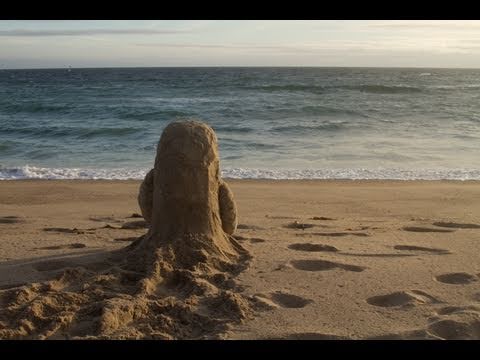
Bottle has some impressively consistent lighting, considering it's shot mainly outside, taking time of day and weather into account. The Dog Who Was a Cat Inside is also quite impressive in terms of this, as it manages to establish day and night effectively, as well as having rather smooth transitions between them.
It's unclear if the content for Bottle was meant to be telling us something. How the two characters meet is clearly meant to be synonymous with online dating, only it's through the classic note in a bottle trope. Of course they have to communicate that way, since they can't exactly swim to each other, but they end up connecting so much that they decide that they have to meet each other in person. They obviously only thrive in their own environment but want to meet each other anyway. This could also symbolise the online daters' own comfort zones being so opposite that they couldn't handle each other? In The Dog Who Was a Cat Inside, the content is quite clearly supposed to resemble a man that feels like a woman inside, and trying to come to terms with that. It could, however, also be about the difference between being masculine and feminine, and trying to find that harmonic balance between the two. Or it could just be about a dog trying to suppress it's inner catlike instincts. This one is a lot more open to interpretation than Bottle.
Bottle is pretty relevant for the time it was made, if my interpretation for the themes are correct, as online dating was very popular in 2010, to the point where dating sites were (and still are) even being advertised on TV. When The Dog Who Was a Cat Inside was released, in 2002, transgender was quite the touchy subject. No one really called it "transgender" that often, actually, because people thought it was a sexuality, and mainly referred to it as "transvestism", and people were referred to as "transvestites" regardless of whether or not they wore the opposite gender's clothing because they identified as them or just felt comfortable in them. Of course, this is still assuming The Dog Who Was a Cat Inside intended on actually having that correlation with this theme. Context would be a factor into this if it was the case.
There wasn't much emphasis on music in these shorts, in fact there was no music at all in Bottle, but they each work around this in their own ways. In Bottle, as I said, there is no music but rather environmental noises, depending on the setting the sounds were mainly ocean noises in the beach scenes, and windy noises in the snowy scenes. There is some very decent sound-design in this, actually, although the sound of the sand scraping the glass bottle goes right through me, I guess that's a good sign on their part though. The music in The Dog Who Was a Cat Inside was pretty generic Paris background music, nothing exactly to write home about, but it does establish the setting and tone effectively. The sound effects are also subtle but well done. It is rather obvious that the dog and cat noises were done by people, but I actually think it works here as it sounds rather silly, adding to the more comedic tone of this short.
Bottle was basically made to tell a cute love story with kind of a twist in the way it turns out, so it works in that sense. Like most indie shorts, it wasn't really meant for a specific target audience. The correlation in it should be more familiar with adults, but it doesn't exactly target them as an audience. It's tone of voice is appropriate for adults and young people, not being too dark or too light. It might actually be that the point of Bottle was to introduce kid's to these adult themes in a fairly light tone of voice. The Dog Who Was a Cat Inside is kind of similar in the sense that it kind of exists just to tell a cute story with real-world themes that a select group of people might be familiar with, but does it in a tone of voice that would appeal to both adults and children, though I think this might appeal to children slightly, because it's not as slow as Bottle and has that rather nice looking 2D/3D art style.


