Friday, 30 January 2015

Visual Analysis: Bottle (2010) & The Dog Who Was a Cat Inside (2002)

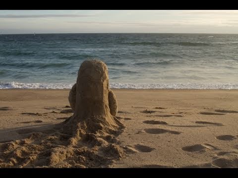
Bottle, and The Dog Who Was a Cat Inside are both low-budget, indie animations, that effectively work around their lack of production values by using cheap methods that compliment their visual style. Bottle uses litter found on the beach, sand, snow, and objects found in the forest, which are obviously free unless you have to pay mother nature for that stuff. Whereas The Dog Who Was a Cat Inside, uses a very simple art style and method for animation. Since the characters in it comprise of mainly shapes, they get away with animating it without putting much thought on the in-betweens, dodging many basic principles of animation, as well as animating at an exceptionally low frame-rate.


Bottle has some impressively consistent lighting, considering it's shot mainly outside, taking time of day and weather into account. The Dog Who Was a Cat Inside is also quite impressive in terms of this, as it manages to establish day and night effectively, as well as having rather smooth transitions between them.

It's unclear if the content for Bottle was meant to be telling us something. How the two characters meet is clearly meant to be synonymous with online dating, only it's through the classic note in a bottle trope. Of course they have to communicate that way, since they can't exactly swim to each other, but they end up connecting so much that they decide that they have to meet each other in person. They obviously only thrive in their own environment but want to meet each other anyway. This could also symbolise the online daters' own comfort zones being so opposite that they couldn't handle each other? In The Dog Who Was a Cat Inside, the content is quite clearly supposed to resemble a man that feels like a woman inside, and trying to come to terms with that. It could, however, also be about the difference between being masculine and feminine, and trying to find that harmonic balance between the two. Or it could just be about a dog trying to suppress it's inner catlike instincts. This one is a lot more open to interpretation than Bottle.

Bottle is pretty relevant for the time it was made, if my interpretation for the themes are correct, as online dating was very popular in 2010, to the point where dating sites were (and still are) even being advertised on TV. When The Dog Who Was a Cat Inside was released, in 2002, transgender was quite the touchy subject. No one really called it "transgender" that often, actually, because people thought it was a sexuality, and mainly referred to it as "transvestism", and people were referred to as "transvestites" regardless of whether or not they wore the opposite gender's clothing because they identified as them or just felt comfortable in them. Of course, this is still assuming The Dog Who Was a Cat Inside intended on actually having that correlation with this theme. Context would be a factor into this if it was the case.

There wasn't much emphasis on music in these shorts, in fact there was no music at all in Bottle, but they each work around this in their own ways. In Bottle, as I said, there is no music but rather environmental noises, depending on the setting the sounds were mainly ocean noises in the beach scenes, and windy noises in the snowy scenes. There is some very decent sound-design in this, actually, although the sound of the sand scraping the glass bottle goes right through me, I guess that's a good sign on their part though. The music in The Dog Who Was a Cat Inside was pretty generic Paris background music, nothing exactly to write home about, but it does establish the setting and tone effectively. The sound effects are also subtle but well done. It is rather obvious that the dog and cat noises were done by people, but I actually think it works here as it sounds rather silly, adding to the more comedic tone of this short.

Bottle was basically made to tell a cute love story with kind of a twist in the way it turns out, so it works in that sense. Like most indie shorts, it wasn't really meant for a specific target audience. The correlation in it should be more familiar with adults, but it doesn't exactly target them as an audience. It's tone of voice is appropriate for adults and young people, not being too dark or too light. It might actually be that the point of Bottle was to introduce kid's to these adult themes in a fairly light tone of voice. The Dog Who Was a Cat Inside is kind of similar in the sense that it kind of exists just to tell a cute story with real-world themes that a select group of people might be familiar with, but does it in a tone of voice that would appeal to both adults and children, though I think this might appeal to children slightly, because it's not as slow as Bottle and has that rather nice looking 2D/3D art style.

Subculture: My Thoughts.

Subcultures mainly consist of groups of people that like to distance themselves from the norm of society, typically due to the oppressive nature of whichever culture they belong to that demands that their social standards be met quite strictly. A few examples of this include goths, street punks, and hippies. This is typically done by dressing and styling themselves in a certain manner beyond social standards, as well as acting unconventionally. Sub-cultures are usually considered rather edgy and controversial, due to society's anxiety towards irregular folks within their community.

Subcultures are often looked down upon but some find their attitude and fashion-sense rather appealing. For this reason, you often find people not part of a subculture but still dressing like them. This has led many clothing stores to market their fashion products towards subcultures and people that look up to them. This kind of breaks the idea of subcultures, since the point of them is to go beyond the norm, and yet their style has become marketable.

Recently, "geek culture" has become rather popular, possibly due to TV series like Big Bang Theory and IT Crowd, and, in my opinion, it has actually led to a more positive perspective on geek culture within society, since before then it was considered more shameful to follow that lifestyle. Both the term geek culture, and people actually identifying as "geeks" is evident that this has essentially become another subculture. Granted, I am someone that by definition fits into this category of subculture but doesn't really identify as it. I feel like the difference between subcultures and everybody else is that they take pride in the fact that they are distancing themselves from society.

I personally think the very existence of subcultures is rather contradictory if the idea is go beyond the norm. They basically end up creating their own norm within their subculture, which is no different to what they were trying to avoid. I mean, are they trying not to conform by... conforming to their own culture? I don't have a problem with people being different, though. I wholeheartedly support individuality, but I don't think developing a group of people to celebrate this is necessarily the right thing to do. I always see subcultures as types of tribes, because people are basically forming a group based on their own differences and live in that particular manner. They create their own comfort zone because of this, and when they see other people/groups outside of that comfort zone, their instincts tend to vary between fascination, confusion, and irritation, most often the latter of the three. I believe this violent aspect of human nature as a species hasn't yet evolved since the Dawn of Man.

Saturday, 18 October 2014

Gaze and the Media

"According to usage and conventions, which are at last being questioned but have by no means been overcome - men act and women appear. Men look at women. Women watch themselves being looked at" (Berger 1972)
image
(1)
image
(2)
image
(3)
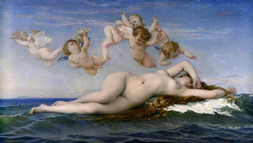
The “gaze” is a theory that describes how genders are stereotypically depicted by all forms of media. Women have been depicted as images to gaze at for centuries, and early works such as The Birth of Venus (1) are examples of this, because the central focus of the image is Venus, shown in a pose that gives the viewer permission to look at her body, and she is depicted resting and looking away from the audience.
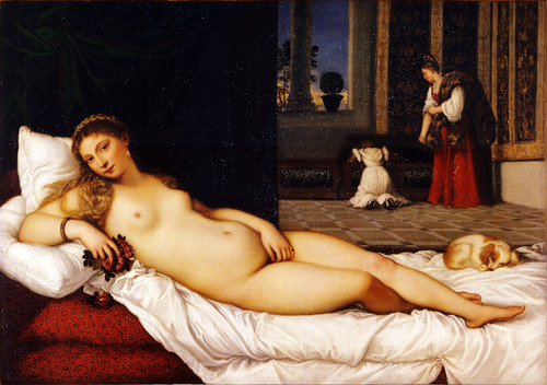
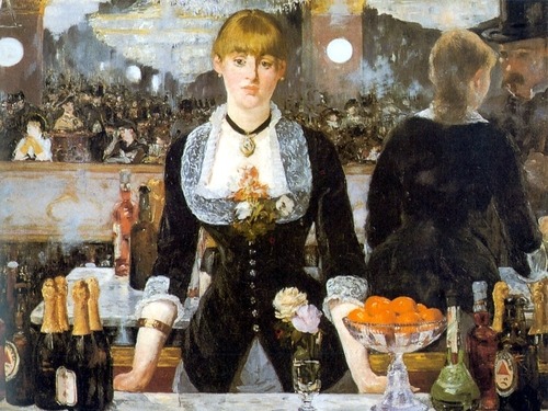
Venus of Urbino (2) depicts a woman resting in her personal environment and watches the viewer provocatively, meaning she knows the audience is watching her but lets them do so. The overall depiction of women in art are shown as nude grown up wealthy/holy women. Bar at the Folies Bergeres (3) explores the viewpoints of art, by placing a woman at a bar simply standing there waiting to take an order, with a mirror behind her showing her backside and a supposed image of the viewer watching her. The setting of the image is realistic but it destroys the concept of perspective by using the mirror behind the woman to show her at a different angle, which would otherwise not be there. It almost seems like the art is conspiring with the viewer to let us look at this regular woman from different angles.
image
(4)
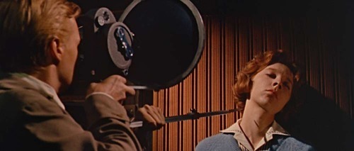
Contemporary media today takes advantage of the male gaze for advertising, using primarily nude models for billboards, magazine ads, etc. The film Peeping Tom (4) depicts objectification in a more sinister manner. It shows how objectification of female bodies affects real life female bodies, and shows the consequences of how that’s exploited in media.
image
(5)
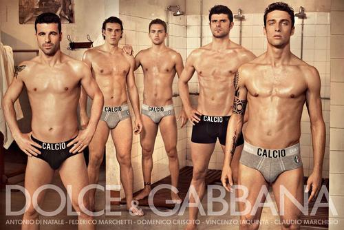
The gaze does not just refer to women, though. There are plenty of images in which men are objectified by media. Dolce & Gabbana (5) have made ad campaigns for underwear. It’s just not as heavy an issue, so to speak, for males. Audiences mainly identify with women as sexual objects, as opposed to men. There are obviously times where that’s not the case but in no way does that actually change anything.
Women are historically marginalised in art history by men, and this has led to women to typically be marginalised today.
image
(6)
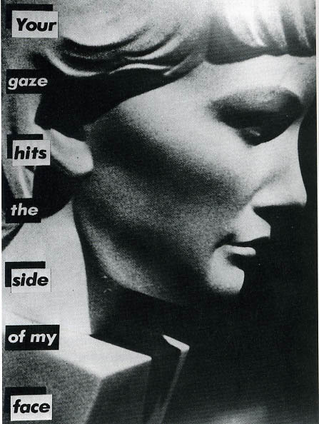
Barbara Kruger’s Your Gaze Hits the Side of my Face (6) is an image of a statue of a woman’s face with the quote, used for the title, in a similar manner to Peeping Tom, by conveying it in a violent manner, and showing that there are real-life consequences to it.
Reality television is an example of the gaze, by giving the audience permission to watch people just talking to each other in their private space and judging their actions. It’s basically giving people this power of voyeurism in a way. 
There have been plenty of campaigns speaking against objectification towards women in media, like the recent “Shut Down Page 3” campaign. Just like any other feminist campaign it ended up causing tonnes of abuse towards the campaign holders through social media.
Another common example of the gaze is the recent nude celebrity photo leaks of 2014, wherein many female celebrities (and like one dude) had nude photos leaked on the internet by people hacking cloud-based data storage.
The gaze affects male and female teenagers mainly, actually, solely due to online posts that supposedly want to relate to people insecure about their bodies, but only encourage the idea that you should worry about how you look and that objectification is something you should conform to.
image
(7)
image
(8)
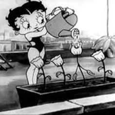
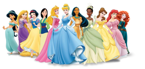
The gaze, overall, affects all forms of media today, movies, television, video games, magazines, art, etc. In terms of animation, it’s not really any different.Betty Boop (7) is a famous example, dating back to the 1920s. While the shorts she starred in were surreal and humourous by nature, there are still several times throughout her shorts (films, I mean, films) where the audience is given power to gaze at her. She was a memorable character that essentially set a standard for the female role in animation. Disney princesses (8), while not exactly conforming to male gaze, were designed in a manner that would make them pretty looking for audiences, even if that meant completely changing the character’s age, race, and personality from the film’s source material. Again, it’s not gaze material, but it does conform to trope of making female characters pretty so that they appeal to people more.
So the gaze has affected the media for centuries now and it has basically gotten to the point where it’s a social standard to objectify and overall give characters and people the model look to gaze at. I personally believe that there’s no changing that because humans as a species feel that empowered when given the opportunity to gaze, and that’s why it’s still happening.
image
(9)
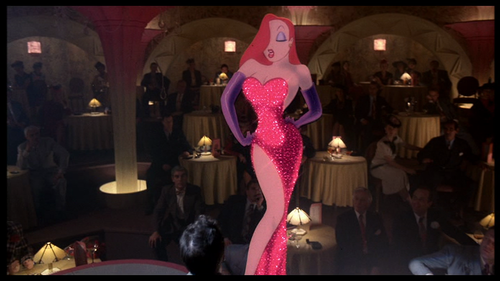
That’s also why it’s good for designers and writers to compromise creatively when characters are designed to be sexy. Jessica Rabbit (9) is another famous animated example. It’s pretty much deliberately over-the-top how sexualised she is, and I say that because while she is of course a sexy character, her design is also extremely disproportionate, with so much emphasis on her legs and bust that her waist is tiny and her legs are freaking tall. It’s seemingly a parody of the typical look given to female characters. Jessica Rabbit is also a pretty strong character, using her sexuality as a weapon most of the time. There’s also the fact the characters that harass her are all punished for it, while Roger Rabbit, the one who’s the most respectful towards her, is actually the one she loves, which I interpret as a moral to respect women, or anyone really, as humans and not just objects.
So I’m personally not against the gaze, I feel like that’s just a word that combines sexualisation and objectification, which I feel are two entirely different things. Sexualisation is acknowledging someone as sexy whilst still treating them as people, whereas objectification is simply treating a person as something to look at and use (like an object). A well-rounded character with sexual traits is far more appealing and respectful than a bland character with a nice body.

Tuesday, 25 March 2014

Animation Development Work

My practical work will be based on the lecture about Visual Literacy. The reason for this is that during the lecture, a particular slide that confused most of the people there. The slide showed a picture of the symbol of Mars and Venus, which are also used to symbolise male and female. The male symbol was pink and the girl symbol was blue, which caused a lot of the people to mistake the two. This raised an interesting thought about why the majority quickly thought the colours meant the gender and not the shapes of the symbols. The whole situation felt like a visual representation on the way society views gender, not as the genuine thing but rather how they act, because association with colours something society thought of, but symbols should be the logical aspect to point to. This is further emphasised by the fact that in the 1920s, pink was considered a more masculine colour, and it seems like it's too quick a time for people to now being sub-concsiously drawn to the idea that pink is for females.


I thought about how could further antagonise this crowd by making this in such a manner that would really get them lost. They looked at the original slide for at least thirty or more seconds, so I thought my version would be a series of images that may or may not be coloured the way they would imagine, and they'd have less than a second per image to get them right.


I figured I would go for a simple look, to show the juxtaposition of their confusion whilst watching it.
This pacing felt right so I developed this into a first draft:


I showed this to people to see if they could follow it. They said they could but whether their mind really played tricks on them or they could just follow it okay, I felt like I had to make it more complicated. SO here's the final version:


As you can see, it has a faster pace, as well as some parodic music to. This one did a better job.

Auteurship and the Avant-Garde

Auteur theory is based on the idea that great filmmakers are considered artists in their own right. It was an idea thought of in the 1950s by Andre Bazin and the writers for Cahiers du Cinema, to show spectators at the time that films are not just products created by studios for profit, but works of art that rivals that of any novelist. Auteurship (which is the French word for 'authorship') is not commonly associated with animated films, due to the medium generally being looked at by critics as a children's medium, as well as associating animation with Disney, which a lot of people admire as the greatest animation studio, and this turned the animation industry into a corporate tool. There were still many great animation auteurs to come, such as Hayao Miyazaki, Ray Harryhausen, and Chuck Jones; however the medium is usually debunked by critics everywhere.

Avant-garde is a term derived from war terminology, that basically means to charge into battle ahead of the main troops, and what the term means in film context is to be more innovative with the narrative, trying different and unconventional approaches. In a sense, Jan Svankmajer manages this perfectly, merging stop-motion claymation with pixillation in his films. He can technically be seen as an auteur filmmaker in this sense, developing his own style of filmmaking and managing to avant-garde in the process.

Genre

Genre is an important aspect to consider when writing a story. It is how we differentiate one film to another, using a set of codes and conventions that signify what type of film it is. These signifiers can vary depending on how they are accomplished, for example, setting and location is considered when establishing genre; is the film based in a suburban area in a modern-day setting or a dimly lit graveyard in a 17th century setting? Is it set in a high school? Is the high school dark and abandoned or is it a regular day in the school? These are all aspects that are important. Animation is technically a sub-genre because it created using a technique completely different to live-action, but the signifiers still work in the same way.

"a family picture!"

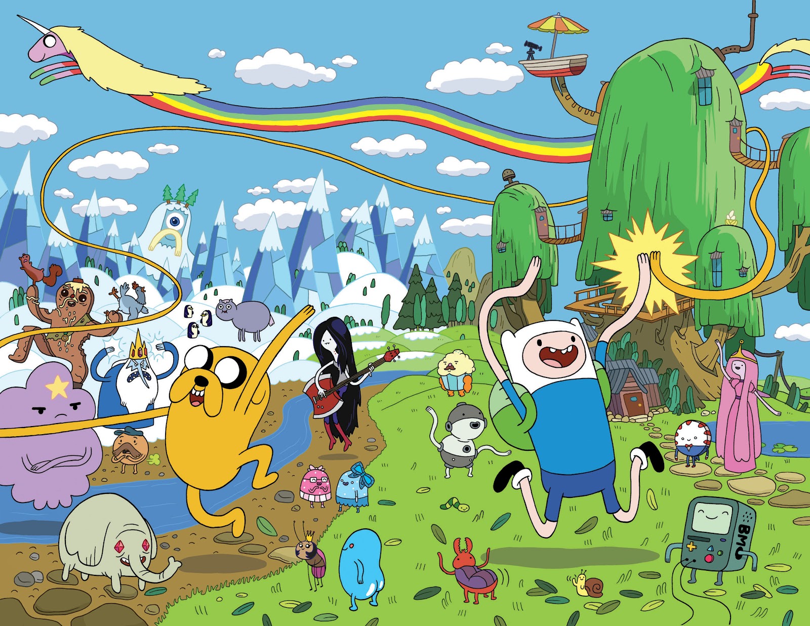
Adventure Time, for instance, has multiple signifiers that point to different genres. The major signifiers, writing, primarily bright and colourful setting, and simplified art style are all signifiers that it's a comedy series. The strong reliance on romantic tension throughout the series is a signifier that it's a romance series too. The surrealism is often used to present the world in a very grim manner, often using the silly looking characters in a more grim, bleak setting, that contrasts greatly from the usual bright and vibrant setting; the music also tends to shift from the light-hearted tunes to very low-key synth; these signifiers point the show towards horror genre very often. The characters also break into song at times, and often the songs are used to contribute to the narrative, making the show a musical as well.

Postmodernism and Postmodernity

Postmodernism and postmodernity is essentially the evolution of modernism and modernity. The process of creating not takes the concept of 'form follows function' to a whole new level, and allows for more creative control with it. Some would argue that designs of simple objects that derive from this are too focused on form rather than function.


For example, Philip Starke's Juicy Salif wouldn't actually function as well as any regular juicer, because the liquid from the fruit would drip down the legs of the juicer. It is an example of how far modernity can be pushed before being unnecessary and dysfunctional. With postmodernism, more risks have to be taken in order to look aesthetically modern, or even look ahead of its time, but still be functional. Although, you could argue that this works because it follows the all the requirements of postmodernism. It adds a sense of complexity to a simple product, a juicer; the design is unique but functions rather chaotically (or at least as chaotic as a juicer can get), it combines a sleek and glossy look with a sort of expressionist style; the end product is ironically dysfunctional, which could be seen as a parodic look at how postmodernism works.

Postmodernism works by breaking conventions to show meaning and get a reaction from spectators. Recently, in Leeds, someone had built a copy of her room and placed it in the middle of a shopping centre, as a way of parodying the trend of using social media to show your personal space to complete strangers. She made a replica of her bedroom based on the condition it was in on her photographs that were posted online, to prove a point as to how we exploit social media, saying that we might as well just remove our bedroom and physically show it strangers.